Ever noticed the layout of a Bed Bath & Beyond retail store? All of the products are strategically grouped and positioned for maximum exposure. The circle design makes it nearly impossible to spend less than thirty minutes shopping. It’s genius.
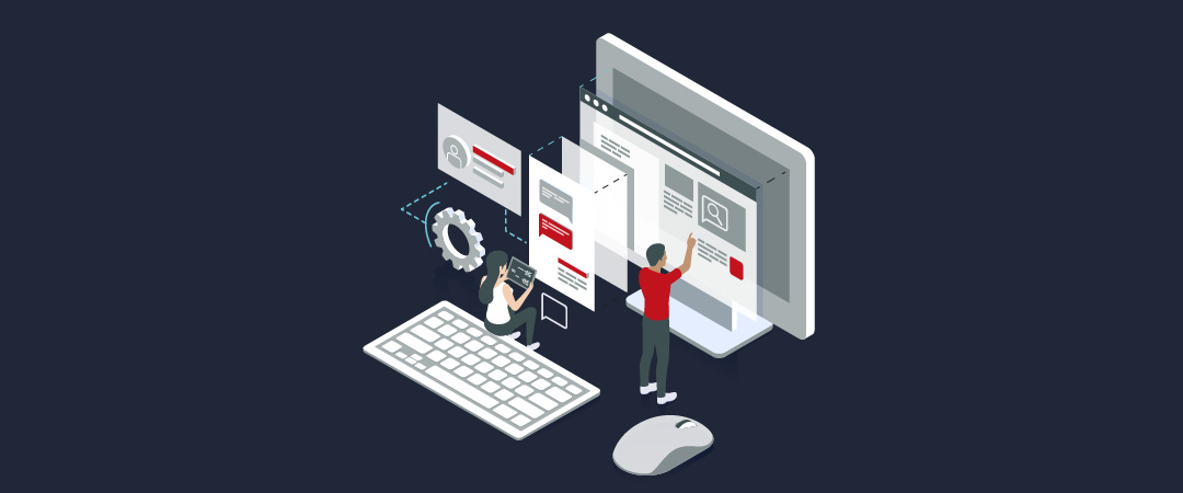
A website can be thought of as a brand’s digital storefront, which makes website usability testing essential. It’s where first impressions are made for prospective customers and loyalty is built with current users. Unlike a physical business location, your website doesn’t have hours of operation so it’s working even when you are not.
Understanding your website visitor’s needs and delivering a solution is of utmost importance. Improving the user experience will:
Lower bounce rate.
This means decreasing the number of visitors who immediately leave (or “bounce”). If your website is a hot mess, a large percentage of visitors will not even give it a chance.
Increase time spent on site and number of pages visited.
These two very important factors measure how site visitors are engaging with your content.
Boost conversions.
Whether it’s a sale, newsletter sign up or video view, every site has some sort of “conversion” or action for the visitor to make.
Build brand loyalty.
A quality website will engage the visitor and keep them coming back for more.
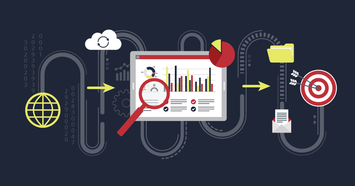
One of the best ways to improve your user experience is to invest in a website usability testing vendor. First create a list of actions that a visitor might make (browse products, watch a video, fill out a form, download instructions, etc.) then send the list to a vendor (like UserTesting) to receive videos of actual people attempting the actions from your list. Sounds a little weird right? It is, but analyzing the results will help you identify the hurdles faced by site visitors when trying to complete the desired actions. Then all that’s left is to remove those hurdles.
Need a few more trusted usability vendors? CrazyEgg provides detailed heat maps showing where visitors click and Foresee provides pop-up usability surveys allowing visitors to provide feedback. Data from these sources will identify further obstacles faced by visitors to your website.
Your online storefront should make it easy for visitors to contact you, find quality information, purchase products and solve their problems. Eliminating the barriers for these actions will make for a quality user experience and a happy customer who will return often — without the lure of weekly coupons. Take that BB&B!
If you want a second set of eyes on your website to check out usability, contact our team of digital experts!
Originally published June 14, 2016
LF Newsletter Alert
Want Lessing-Flynn to rock the socks off your inbox with insights and more?


