A quality photo is just as important (if not more) as a quick and witty headline in today’s media. The more engaging your image is, the more click-throughs, likes, loves and wows (*eye roll* thanks a lot Facebook… all we wanted was a “dislike” button) your post will receive. I mean, that’s the end game right? More viewership and loyalty. So, picking the right image is paramount.
As a designer, I’ve become very familiar with the phrase: A picture is worth a 1,000 words. And that might very well be true, but when your options are limited for a project and you have to resort to stock images to fill the gap – well sometimes those 1,000 words can turn to mockery. If you’ve scanned through any stock image gallery lately you know exactly what I mean, but allow me to show you a few gems just for fun.

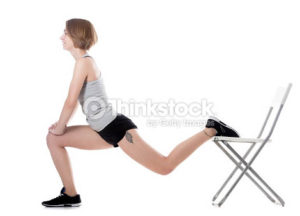
Search term: “Exercise”
I don’t know about you, but I love to get up every morning, walk into my big white room and stretch using a folding chair. Yes.

Search term: “Collaboration”
The woman in the black is all like: “Kathy, I’m sick of looking at your cat photos. This isn’t even your cat.”

Search term: “Productivity”
Let me just be productive by avoiding this meeting to be on my phone inside this all glass room.

Search term: “Communication”
Let’s pretend for a minute that this illustration isn’t the definition of Clipart and just look at the concept: someone is thinking about communicating about communication? This is like… communication INCEPTION! My brain hurts – what year is it?!

Search term: “Teamwork”
This might say teamwork to some, but to me it says, “HR situation in the making.”
Now I’m not trying to bag on Thinkstock – they’re just trying to provide people like me with images that at least “sort of” work for your needs. Just remember sometimes you have to dig a little to find the actual gems in the ocean of free images. Here’s a few attributions I look for when choosing stock photography.
- Vibrant colors
- Clear subject
- Image appears to have depth
Staying on-trend is always important as well. Here are a few trends to keep in mind for 2016:
- Images covered in a gradient. Images with washed-out exposure (Ex. Newspaper-y tone).
- Top down shots (Ex. Looking down at a desk where everything is nicely laid out – people with OCD LOVE these photos.).
- Big, open shots with a small subject. These are meant to make you feel serene. Super close-up images (Ex. Someone’s eyes and the bridge of their nose.).
- You can’t always find these things in a photo, but use your best judgment and take into consideration the work the photo will be representing.
LF Newsletter Alert
Want Lessing-Flynn to rock the socks off your inbox with insights and more?


