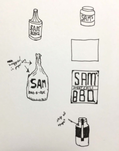
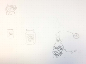
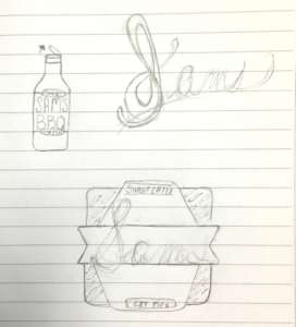
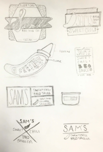
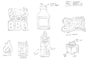
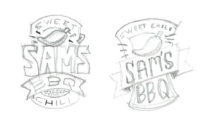
Artists love to doodle, so a majority of graphic designers start a project by sketching a thumbnail design. For the non-art folks, a thumbnail can be generally defined as a small hand-drawn sketch. They’re handy because they allow you to fit several drawings on one piece of paper. As visual people, we use these sketches as a way to brainstorm and get as many ideas — good or bad — out of our head and on to something tangible.
I’m not here to tell you how important it is for designers to sketch before starting projects. You can find those articles all over the internet. My intent is to illustrate how each designer is different in how they think and how they use thumbnails in their creative process. What one artist uses to remind themselves of an idea most likely means nothing to their colleagues.
I gave our creative team a little exercise to prove my point. They were given a creative brief to design new packaging for a fake barbecue sauce product and told to create thumbnails to showcase their concepts. Here’s the creative brief:
“Sam’s Sweet Chili BBQ Sauce Company needs a label design for their bottled sauce to be sold in supermarkets. Think about how the packaging can stand out against its competitors on a shelf. Like the name says, the flavor is sweet chili, so it has a kick. Use that as inspiration for your design. Consider all aspects of the packaging in your design/sketch, including the label and the container itself.”
Let’s see what we can find out about our designers through their sketches, shall we? Just like handwriting, it’s amazing how unique thumbnail sketches are to each designer.
LF Newsletter Alert
Want Lessing-Flynn to rock the socks off your inbox with insights and more?
